
A recent study by the Governors Highway Safety Association has been making the rounds this week. It shows an increase in bicycle fatalities nationally and a slight decrease in Arizona bicycle deaths between 2010 and 2012.
The headlines across the internet have focused on the increase suggesting bicycling is getting more dangerous. As Streetblog.org points out the stories fail to consider the overall increase in the number of people biking.
It’s true that the number of bike fatalities nationwide has increased over the last two years, from 621 in 2010 to 722 in 2012 — thus the bizarre infographics and hysterical headlines about the “growing problem” of bike fatalities. Buried deep in the report, though, GHSA notes that the annual death rate of cyclists is actually “among the lowest since 1975,” when U.S. DOT’s Fatality Analysis Reporting System first started compiling this data:
The highest annual total (1,003) occurred in 1975. Yearly deaths averaged 933 from 1975 to 1979, 889 in the 1980s, 792 in the 1990s, and 696 from 2000 to 2012. The 621 deaths in 2010 were the lowest in the 38 years of FARS.
But yes, between 2010 and 2012, the number of bike fatalities did increase. And that’s because the total number of bike trips in the country has been soaring.
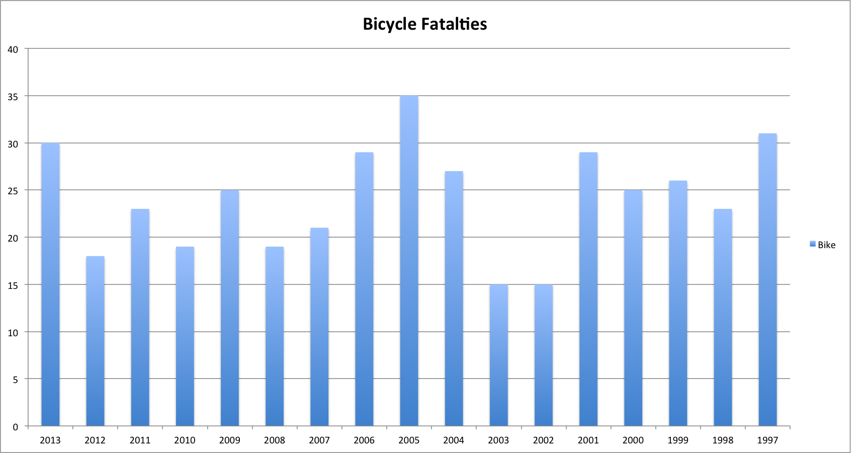
As for Arizona, when including data from 2013, it shows a 57 percent increase in bicycle fatalities since 2010.
But Arizona Department of Transportation data recorded for the last 17 years shows bicycle and pedestrian deaths have risen and fallen without a clear trend over that period.
There are three years in which Arizona has seen 30 or more bicycle fatalities. They are 1997, 2005 and 2013, which represent the first year of data available, the middle year and the last year included in the data. (See the graph above.)
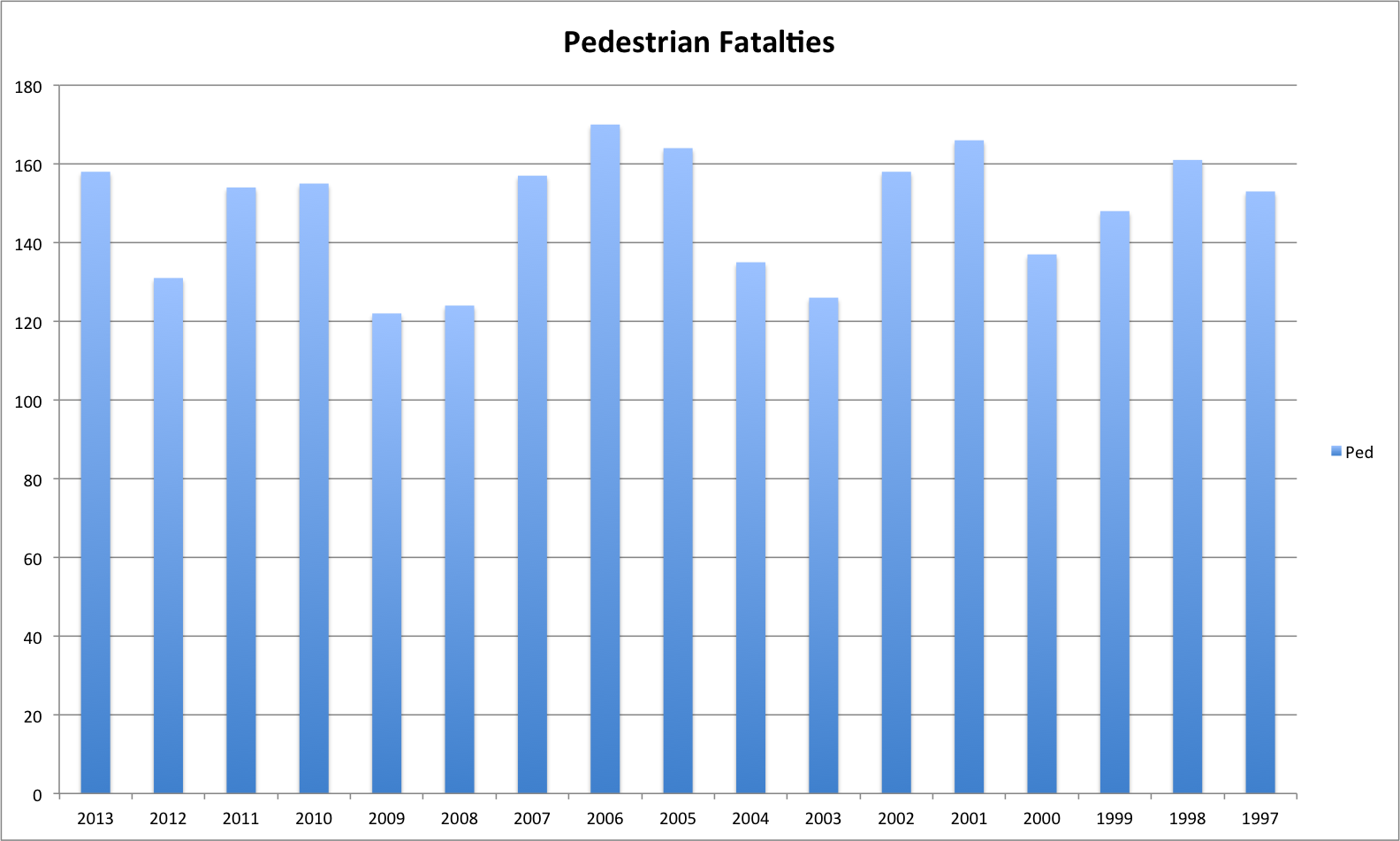
Pedestrian deaths also rise and fall across the last 17 years without a clear pattern.
Using a ‘spike’ year to imply a trend is incorrect. The average of the recent half of the chart against the oldest half of the chart, throwing out the highest and the lowest, is 23 to 25. The 2010-2012 numbers happen to coincide with what looks to be the trend for the last nine years. Hard numbers to validate the increase in ridership aren’t there, but we can see a significant increase.
The interesting conjecture might be what we can see as the biggest factor in this trend. The biggest difference I’ve noticed over the period that individuals have done is use effective night lighting. Government’s efforts to educate ridership in the schools may be another significant factor which also focuses on individual behavior.